Templates
Every guide is based on a template which applies to all pages within a guide... you can't mix templates in the same guide. LibGuides comes with two default templates which you should not use. Be sure to use UCLA's custom templates rather than the defaults!
Templates are divided into two basic layouts: Side-Navigation and Tab-Navigation. As of 2017, UCLA will only be using Side-Navigation templates, with the exception of the "Single Page" template.
 UCLA Default Template
 UCLA Default Template
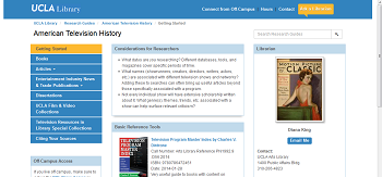
This is the standard side-nav look. It should be used for all guides unless the content specifically requires a multi-column layout.
 UCLA Alt Template: 2 Cols (50/50, 60/40, and 75/25)
 UCLA Alt Template: 2 Cols (50/50, 60/40, and 75/25)
Two content columns, of varying proportions. Use two content columns only if your guide's content specifically requires such a layout, for example if every page includes "sidebar" content that supplements the main content column. Sidebar content may be the same on every page or unique, but even if unique sidebars work best when the type of content (e.g. definitions, further help, recommended reading, new materials) is consistent so users know what to expect.
Note that if you're using box-level navigation, only the left-side column will be listed. Also, on a smaller device, the third column will show below the middle column, rather than to its right.
UCLA Alt Template: Flex Columns
This one takes some explaining. It's a two column layout, but the widths aren't fixed. The browser will do a "best-guess" at widths based on the amount of content in each column, though the first column will always be at least 50%. Most importantly, if you put no boxes in the right column it will set the width to 0, so that page will look like a 1 column layout. This is the only side-nav template that lets you vary the layout from page-to-page, with the caveat that you don't have any control over the column widths.
Use Flex Columns only if your guide requires a mixture of one-column and two-column layouts.
 UCLA Alt Template: Single Page
 UCLA Alt Template: Single Page
Use this one only for one-page guides. It's technically a tab-navigation template, but the tabs disappear if there's only one page, transforming it into a "No-Navigation" layout.
Box-Level Navigation
The "Above the Fold" Rule
If you're not using box-level navigation, make sure all your boxes start "above the fold," i.e. the top of every box should be visible without scrolling.
People will scroll to follow existing content downward, but won't scroll down just to see if something new might be there. Boxes that start below the fold are invisible unless you've got links higher on the page. Combine the content into another box or start another page.
Side-navigation templates offer the option of "Box-Level Navigation", essentially sub-menus that list (and link) the boxes on the page. For an example, see this guide. It's extremely useful for longer pages, since it tells people what lies "below the fold" without scrolling.
Box-level navigation has one major limitation. It only applies to Column 1. If you have a Column 2, or put boxes in the column under the side-navigation elements, those boxes will not be listed in the menu.
How Many Pages?
Pages are the primary organizational and navigational features of your guide, so spend time making them easy to use. Some tips:
- Keep the number of top-level pages small. The top-level list should fit on a single screen without scrolling.
- Keep your page titles short. If you want your page to have a subtitle or more explanation, there's an optional Description field for each page, text which will appear if the user mouses over the page link.
One issue with the second-level drop-down pages: there always has to be a top-level page for them to go under. If you leave that page blank, you're wasting prime real estate and may confuse users. Some other options to consider:
- If there's some information common to all the sub-categories, put it on the top-level page. You can always repeat it on the second-level pages. (This could be your source of Master Boxes for this sub-set of pages.)
- Since this is the page visited by anyone who did not pick a sub-category, it's a good place to add introductory material or definitions that will help a user choose the best sub-page from the list.
As with any navigation system, keep in mind potential confusions or ambiguities. You not only need to steer people to the right page, you need to steer them away from the wrong pages.
Responsive Web Design
No matter which layout you choose, it's important to note that your boxes will move around! LibGuides uses responsive web design, a technique which automatically re-organizes the content to display well on smaller screens like tablets and phones. You can see it in action even on a large monitor by simply re-sizing your window.
Because of this, it's important to avoid using "positional language" to help users navigate. Never refer to something on the page as above, below, left, or right... because it might not be there on the user's screen! Instead link to the content you want them to see--every box has a unique URL. Don't force your users to needlessly hunt for your content!