Data Visualization Overview
Data Visualization is one of the most critical aspects of research. It allows researchers to see patterns and trends in data that are not easily observable when looking at raw information. Over the last two decades, technology has dramatically advanced the scale at which data can be visualized. In addition, more public data is available than ever before, allowing for both researchers and citizen scientists to create excellent visual stories with their data.
There are two different approaches to data visualization:
-
Exploratory: Your purpose for visualization is the exploration and understanding of trends in your data, either for the purpose of data analysis or the preparation of it.
-
Explanatory: Your purpose for visualization is to clearly and effectively communicate something about your data to a wider audience.
With a focus on explanatory data visualization, this guide is designed to help users with finding datasets and resources, outline general approaches to data visualization for the purpose of effective communication, and provide a list of tools useful for creating beautiful visualizations.
Why Visualize Data?
A good example illustrating the significance of data visualization is Anscombe's Quartet, where four different datasets have the same simple statistics but look very different visually.
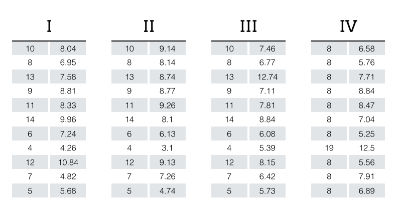
Source: MultiThreaded
These datasets have the same average and variance for their x and y variables, the same correlation between them, and the same linear regression line (with an accuracy of at least two decimal points). Thus they would be basically indistinguishable from one another when compared through a table of these simple descriptive summary statistics.
However, this is actually really misleading because the datasets have very different distributions from one another, which becomes immediately apparent when they are graphed. Visualizations are powerful because they allow us to quickly and intuitively understand data and patterns that they hold.

Source: Anscombe, Francis J. (1973) Graphs in statistical analysis. American Statistician, 27, 17–21
Finding Datasets in Repositories
Data repositories contain published datasets that are typically associated with publications or ongoing research projects. Data repositories are used to store and preserve data so that researchers can access and analyze it.
There are two types of repositories we will discuss: scholarly and public.
-
Scholarly: Scholarly data repositories are managed by organizations or scientific societies and often have stricter guidelines on the format and level of detail in submissions. They generally are well-maintained, containing data sets from well-controlled studies, and that include detailed descriptions and metadata. Access to these repositories may be restricted.
- Public: While some data repositories are accessible only to select user groups, many are publicly accessible to anyone with an internet connection. Public data repositories can have a lot of interesting and useful data, but make sure to carefully evaluate the source and scope of the data, as well as the inclusion and preservation practices of the repository itself.
When searching for data in scholarly repositories, be sure to check to see if it is associated with a research publication. Make sure there is enough information in the record to be sure you can reuse the data correctly.
Here are some scholarly repositories:
-
DataCite DataCite is a global non-profit organization that provides persistent identifiers (DOIs) for research data and other research outputs. Use it to locate, identify, and cite research data.
-
Dryad An international repository of data underlying peer-reviewed articles in the basic and applied biosciences. Maintained by the University of California.
-
Figshare Repository for all research outputs in any discipline.
-
ICPSR The Inter-University Consortium for Political and Social Research encourages and welcomes data deposit. Among the services offered, ICPSR describes data fully for Web discovery and protect respondent privacy, ensures long-term data availability, and ICPSR staff are available to answer questions about downloading and using data.
-
Mendeley Data An Elsevier managed data repository, containing data from Elsevier journal articles and more.
-
Nature-supported Scientific Data Repositories List of repositories recommended by the Scientific Data journal published by Nature Research
-
NIH-supported Scientific Data Repositories A comprehensive but not exhaustive list of scientific data repositories supported by the National Institutes of Health (NIH)
-
Open Science Framework An open project management platform which can store project metadata, protocols, and their associated data
-
re3Data A global registry of research data repositories that covers repositories from different academic disciplines with topic narrowing search functions.
-
UC Irvine Machine Learning Repository The UCI Machine Learning Repository is a collection of databases, domain theories, and data generators that are used by the machine learning community for the empirical analysis of machine learning algorithms.
-
UCLA Dataverse (former Social Science Data Archive) Raw US Census data from Los Angeles area. Collection of surveys, enumerations, public opinion polls, and de-identified administrative records. Topics of studies include political attitudes and behavior; social and economic attitudes and behaviors; studies of health status and health outcomes; families, children, and women; international surveys of occupational and social mobility; the Los Angeles County Social Surveys; California Polls; and, census data for the United States and other countries.
-
Vivly Vivli provides managed access to data from completed clinical trials around the globe and facilitates the ability to integrate data from existing platforms and data repositories.
-
Zenodo Enables researchers to share and preserve any research outputs in any size, any format from any discipline. Funded by European organizations. Integrates with GitHub.
-
Sage Data (powered by Data Planet) This link opens in a new windowA repository of publicly, privately, and commercially sourced statistical time-series data, with integrated analysis and mapping tools.
And here are a list of public repositories:
-
Awesome Public Datasets An extensive list of topic-centric public data sources maintained and supported by a large community.
-
Data.CA.gov The State of California was one of the first states to launch an open data repository. Data.CA.gov was designed to provide a single source of raw data in the state.
-
Data.gov Public access to high value, machine readable datasets generated by the Executive Branch of the Federal Government. A compilation of government data that continues to grow.
-
Digital humanities-specific text corpora Digital humanities-specific text corpora for curated by Alan Liu
-
English Corpora A community that publishes free-to use data sets and code for cleaning and visualizing data on a wide variety of topics.
-
Kaggle Kaggle contains a wide variety of public data sets and research notebooks with a diverse and robust community.
-
Open Access Directory Data Repositories A list of repositories and databases for open data. The list is arranged alphabetically, by subject.
-
Social Explorer Social Explorer provides easy access to demographic information about the United States. There are thousands of interactive data maps going back to 1790.
-
Tidy Tuesday A community that publishes free-to use data sets and code for cleaning and visualizing data on a wide variety of topics
-
United States Census Data The US Census bureau opens its data to the public, provides quick facts about the United States population, and even provides data visualizations of its own.
-
World Population Review: US States Collection of information on various characteristics about US states. For a collection of data sets, look under the 'State Listing Articles' box which is further down on the page.
When collecting data, there are two main considerations.
First, research data sometimes has to be purchased and/or used under strict terms of agreement, or following specific privacy protocols. When purchasing data sets, or downloading protected data, be sure the data is stored in a safe and secure environment. It's important to respect copyright permissions and understand what constitutes fair use.
Second, carefully looking into the context and content of the data can help you understand any potential biases or limitations to prevent misuse. Data that is published is often associated with specific experimental strategies. While the strategies and limitations are often discussed when data are published with research papers, this information is not always available with the data set. When selecting a data set for use:
- Understand the methodological limitations to the data collection
- Look for a data dictionary, or some sort of readme file that contains clear information about the variables and observations found in the data set
- Try to find information on the context in which the data was collected, as this can inform limitations on how data should be used
-
Fair Use InfographicThe Association of Research Libraries (ARL)
-
A Guide to Works You Can Use FreelyUniversity of Montana library guide
-
Copyright BasicsUniversity of Cincinnati library research guide