Planning: Important Considerations
There are a few important questions to consider when planning an effective visualization:
Who is your target audience?
In general, an effective visualization should be quickly and easily readable by everyone. However, considerations of audience expertise, requirements, preferences, and expectations are still important in determining your graphic type and presentation stylization.
What message are you trying to communicate?
Designing your visualization with a clear purpose in mind will help you make decisions that leave your audience with a clear takeaway about your data, making your visualization an effective one.
What context is important to understanding the data and your message?
Failing to properly address the context can hinder readability and even result in misleading visualizations.
How do you intend to communicate your message and any necessary context?
With the previous questions in mind, select a visualization type suitable for your data and message. Are there any things you can do to emphasize your message and increase readability?
Without context, statistics and visualizations can be incredibly misleading. A lack of context may be especially hard to notice in visualizations as they are typically designed for quick, intuitive communication. The importance of context can be seen with visualizations regarding COVID cases.
Comparing cumulative COVID cases monthly in different US states seems like a perfectly fine and even illuminating graph. It may lead us to certain conclusions about which states have the fastest spread of COVID or perhaps the most ineffective COVID policy or enforcement.


COVID 19 data from New York Times and average population estimate for 2020-21 calculated using Government Census Data
However, the statistic of cumulative COVID cases in each state does not tell the full story, as it ignores the state population differences which are strongly skewing this statistic. The number of COVID cases per 100,000 people would give us a more accurate idea of the situation in each state because it allows us to look at the number of cases with proportion to the state population. Depending on what we are trying to find and convey, we may also want to consider population density, number of average daily exposures to COVID, and number of COVID deaths, among other contexts.
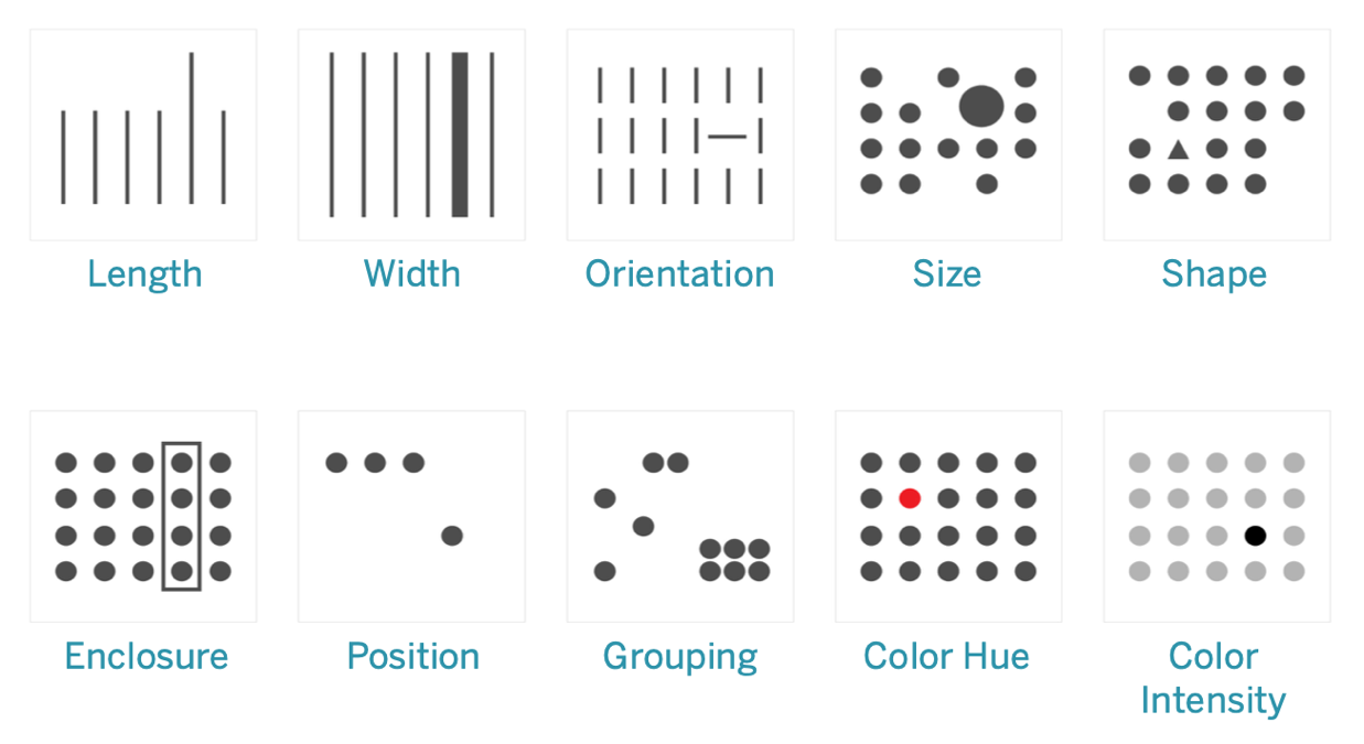
As visualization rely on perception, you should take advantage of intuition of visual processing through preattentive attributes.
Preattentive attributes are visual characteristics that processed by us incredibly quickly, allowing us to notice things even before consciously focusing our attention on it. They often are interpreted naturally, but may be processed at different levels of precision. For example, we can more easily perceive differences in length and position compared to differences in width and size.
Aside from representing quantitative differences, these can also be used to emphasize information. For example, enclosing a section in a box or highlighting a datapoint in red when the other points are grey will immediately draw the viewer's attention to that data.
Source: Tableau
Best Practices
-
What to consider when choosing colors for data visualization Datawrapper Blog
-
Dataviz CheatsheetInfographic outlining general considerations and tips for effective data visualizations
-
UCLA Collaboratory: Data Visualization WorkshopGoogle slides for data visualization workshop hosted by UCLA Collaboratory
-
Interactive Data Lab (University of Washington)This site is for more advanced data visualization research considerations, as it includes publications studying "the perceptual, cognitive and social factors affecting data analysis in order to improve the efficiency and scale at which expert analysts work, and to lower barriers for non-experts."
-
Guardian DataJournalism data visualizations from the Guardian, often includes link to the data
-
Information is BeautifulData from the visualizations on Information is Beautiful- made available in a Google Spreadsheet.
There are a number of accessibility considerations to pay attention to when you are designing a graphic or visual for your research. First using intuitive visual strategies, as described above, will make it much easier for readers to interpret information. When using colors, be sure to use colors that are colorblind-friendly to be sure people are able to understand what the colors are for. For individuals who need to use screen-reading software, be sure to compose Alt-Text that can be read by a screen reader that describes the content in the graph.
We have included some resources below that may be helpful when considering accessibility.
-
Viz PaletteSee what your color palette looks like to people with different types of color blindness
-
Chrome.js Color Scale HelperThis site helps you find colors in a gradient with the biggest difference between each step and lets you know if the palette is colorblind safe or not
-
ColorBrewer 2.0Interactive site to generate color palettes that includes an option to only show colorblind friendly options. See the creator's blog for information on the background of this tool